Palladian Blue vs Woodlawn Blue: An In-Depth Look at Two Iconic Shades

Andrea Erickson
Andrea Erickson, an esteemed BPA Advisor specializing in Interior Design & Staging, takes delight in sharing her extensive knowledge and expertise in renovation and interior design. With a focus on interior design and staging, Andrea contributes valuable insights that shape discussions on innovative construction practices and materials, particularly in the realm of creating aesthetically pleasing and functional interiors.
The color selection for a room greatly influences its overall appearance and ambiance. Picking the ideal hue for your walls has the potential to dramatically change a space, creating a more spacious, comfortable, or lively atmosphere. This article delves into a detailed comparison of two renowned Benjamin Moore shades: Palladian Blue and Woodlawn Blue. While these colors might appear similar upon initial observation, there are slight distinctions between them that can significantly impact the final result in your space.
Overview of Benjamin Moore's Palladian Blue and Woodlawn Blue
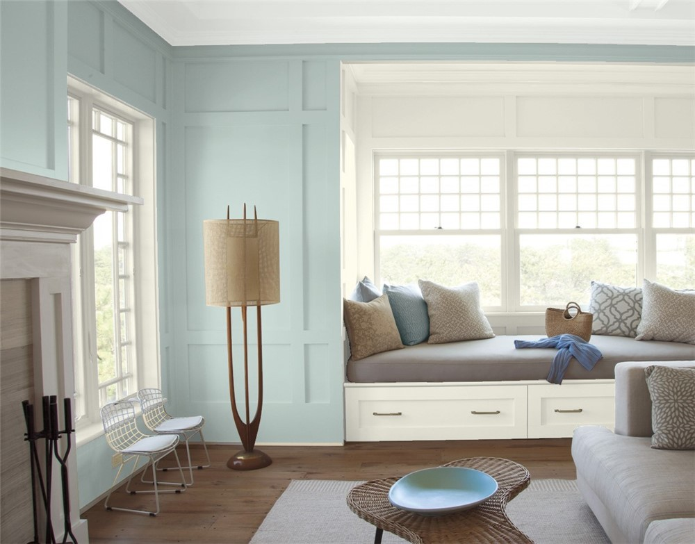
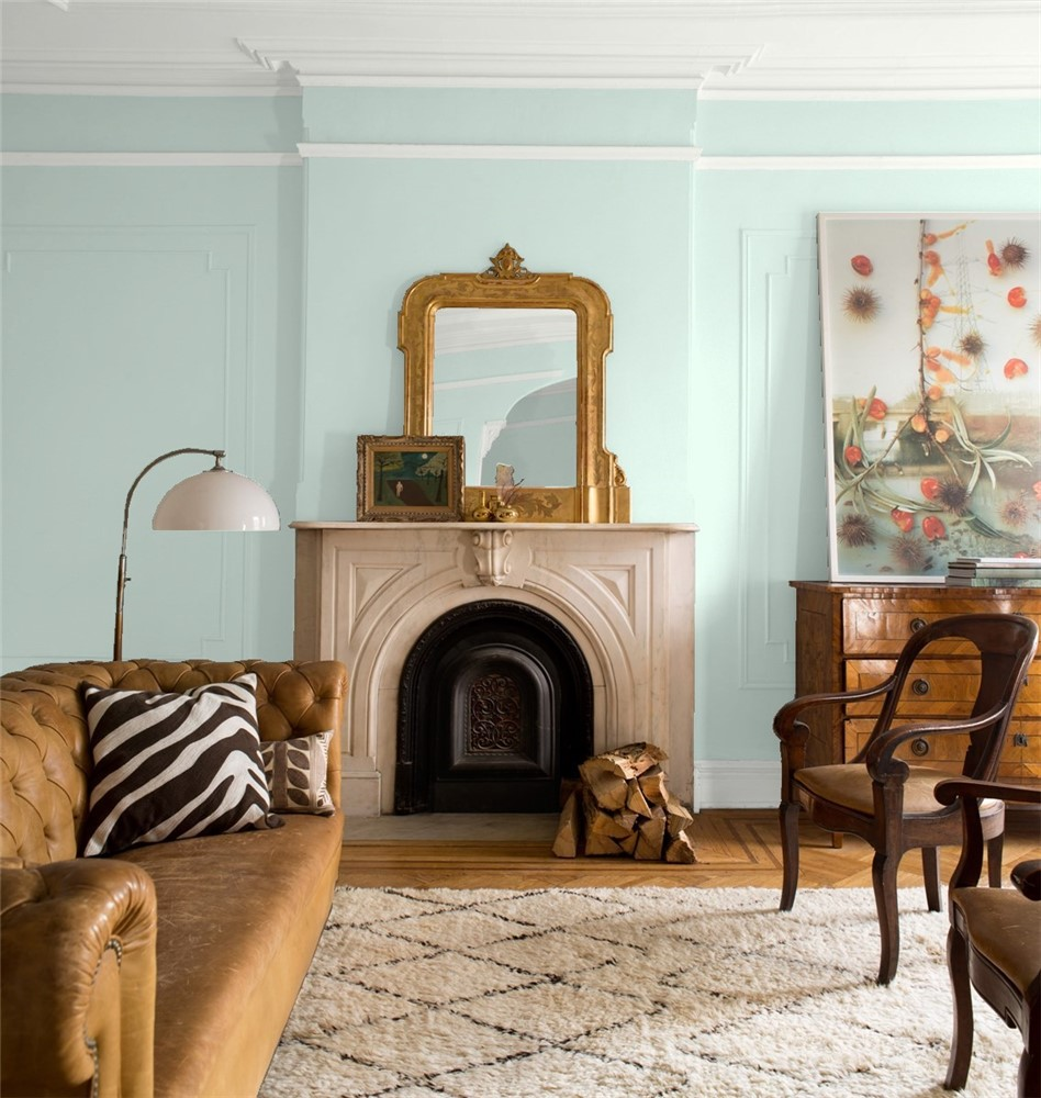
Benjamin Moore's Palladian Blue is a popular paint color known for its heavy green and gray undertones, which blend with the blue to create a soft, versatile, and neutral vibe. On the other hand, Woodlawn Blue, is slightly more blue than Palladian Blue, making it the preferred choice for those seeking a cooler, bluer hue for their space. Both colors share similar light reflectance values and depths, making them suitable for various applications and design styles.
Light Reflectance Values and Depths
Both Palladian Blue and Woodlawn Blue have similar light reflectance values (LRVs) and depths. Light reflectance value is a measurement of how much light a color reflects, while depth refers to the richness or intensity of a color. The similar LRVs and depths of these two colors mean that they will both have comparable effects on the atmosphere and mood of a room. The similar brightness levels of these two colors also contribute to their overall similarities.
The Subtle Differences: A Bluer Shade
Despite their similarities, there are some subtle differences between Palladian Blue and Woodlawn Blue that can impact the final look of your space. Woodlawn Blue is slightly more blue than Palladian Blue, making it the better choice if you prefer a bluer shade for your room. This seemingly small difference can actually have a significant impact on the overall feel of your space, as a bluer shade can create a cooler, more calming atmosphere.
Versatility and Applications
Both Palladian Blue and Woodlawn Blue are incredibly versatile colors that can be used in a wide range of spaces and design styles. Their similar LRVs, depths, and brightness levels make them suitable for various applications, from small, cozy nooks to open, airy spaces.
- For spaces filled with abundant natural light, Palladian Blue is a suitable choice, as its subtle green undertones contribute to a soothing and peaceful ambiance.
- This color is ideal for living rooms, bedrooms, and bathrooms, where a tranquil atmosphere is preferred.
- Moreover, Palladian Blue complements a wide range of hues, such as neutral shades like gray and beige, and more vivid colors like coral and mustard yellow.
Woodlawn Blue, with its slightly bluer hue, is also an ideal choice for many different spaces. Its cool undertones make it a popular choice for coastal-inspired interiors, as it evokes the feeling of being near the ocean.
- Woodlawn Blue works well in spaces like kitchens, dining rooms, and bedrooms, where its calming effect can enhance the overall atmosphere.
- When paired with crisp white trim and light-colored furniture, Woodlawn Blue can create a clean, fresh look that's perfect for contemporary and transitional design styles.
Considerations for Choosing the Right Shade

When deciding between Palladian Blue and Woodlawn Blue for your space, consider the following factors:
- Undertones: Despite the many similarities between the two colors, the nuanced distinctions in undertones can greatly influence the final appearance and ambiance of a room. If you're inclined towards a marginally cooler, bluer hue, Woodlawn Blue is the better option. Conversely, if you appreciate a touch of green undertone for a calmer atmosphere, Palladian Blue is the ideal choice.
- Lighting: The amount of natural light your space receives can affect the appearance of the paint color on your walls. If your room has an abundance of natural light, the green undertones in Palladian Blue may become more pronounced, while the cooler blue of Woodlawn Blue may be more visible in spaces with less natural light.
- Existing Decor and Color Scheme: Consider the existing color palette and decor in your space when choosing between these two shades. Both colors pair well with various hues and design styles, but be mindful of the undertones and how they will work with your current furnishings, textiles, and accessories.
- Mood and Atmosphere: Consider the mood you want to create in your space. If you're looking for a calming, soothing environment, either color will work well, but their subtle differences in undertones may sway your decision. Woodlawn Blue's cooler tones may create a more serene atmosphere, while the green undertones in Palladian Blue may evoke a more tranquil, peaceful vibe.
- Sample Testing: Prior to settling on a paint color, it's prudent to apply a small sample to your walls to assess its appearance in your unique setting. This enables you to evaluate how the color is influenced by varying light conditions and how it complements your current furniture and decorations.
Discover the Subtle Differences Between Palladian Blue and Woodlawn Blue to Create a Space That Reflects Your Personal Style
Palladian Blue and Woodlawn Blue are both incredibly versatile colors that can be used to create a variety of different atmospheres in any space. When deciding between the two shades for your home or business, consider factors such as undertones, lighting conditions, existing decor and color schemes, moods you want to evoke, and test samples on walls before committing. Ultimately, these subtle differences will help you choose the perfect shade that reflects your own personal style.
Get Smarter About Building Products
Join 50,000+ subscribers and get our 3 min daily newsletter on what matters in the building materials industry.
You might like this

Edgecomb Gray vs Revere Pewter: Greige Color Showdown
When it comes to the battle of Edgecomb Gray vs Revere Pewter, these two popular paint colors from Benjamin Moore offer unique characteristics that make them both highly sought-after choices for interior and exterior applications. In this in-depth analysis, we will explore the subtle differences between Edgecomb Gray and Revere Pewter, as well as their […]

Lifetime Steel Post vs PostMaster Fencing: In-Depth Guide
When it comes to fencing, the choice between Lifetime Steel Post and PostMaster Fencing can be a challenging decision for both DIYers and professional builders. In this blog post, we will dive deep into the features and styles of these two popular fence posts options. Lifetime Steel Post Features and Styles The Lifetime Steel Posts […]

Sunrise Windows vs Andersen: Comparing Quality & Efficiency
When it comes to choosing the right replacement windows for your home or construction project, Sunrise Windows and Andersen are two leading contenders in the market. Both companies offer a variety of window options with distinct features and benefits that cater to different needs and preferences. In this comprehensive comparison between Sunrise Windows vs Andersen, […]