Alabaster vs Swiss Coffee: Comparing Popular Neutral Paint Colors

Andrea Erickson
Andrea Erickson, an esteemed BPA Advisor specializing in Interior Design & Staging, takes delight in sharing her extensive knowledge and expertise in renovation and interior design. With a focus on interior design and staging, Andrea contributes valuable insights that shape discussions on innovative construction practices and materials, particularly in the realm of creating aesthetically pleasing and functional interiors.
Choosing between Benjamin Moore's Swiss Coffee and Sherwin Williams' Alabaster for your upcoming home painting project might be challenging, as both shades enjoy widespread popularity. Nevertheless, they exhibit unique characteristics such as undertone, hue, sheen, and overall popularity. This article will provide a detailed comparison of these two white shades, helping you make an educated choice.
Choose a High-Quality Paint
It is important to select a paint that contains:
- High-grade pigments to enhance the color retention, coverage, and overall visual appeal of the paint.
- Sturdy resins or binders to ensure excellent adhesion and resistance to peeling or chipping over time.
- An ideal balance of solvents. This is critical, as it contributes to proper drying, leveling, and overall performance during the paint application process.
- Additives can be added to paint to improve its durability, visual appeal, and ease of use, by providing specific performance attributes such as stain-blocking, mold and mildew resistance, or enhanced flow and leveling.
High-quality paint usually has better coverage, meaning you need to apply fewer coats for a more even finish. It also lasts longer and maintains its original color and appearance. To get a smooth and professional-looking finish, it's important to pick paint that is easy to apply. Look for high-quality paint that has good flow and leveling properties.
What is the Importance of LRV Value?
The Light Reflectance Value (LRV) is a measurement indicating how much light a paint color reflects. Swiss Coffee has an LRV of 83 while Sherwin Williams Alabaster has an LRV of 82, making them comparable in light reflecting values. The more light a pain reflects, the brighter the room appears. Sheen is a term used interchangeably with LRV and refers to the type of finish a paint has. There are different types of sheens from Flat, to Hi-Gloss Enamel. Since both Alabaster and Swiss Coffee are high-gloss paints, they can make any room appear brighter.
Benjamin Moore Swiss Coffee
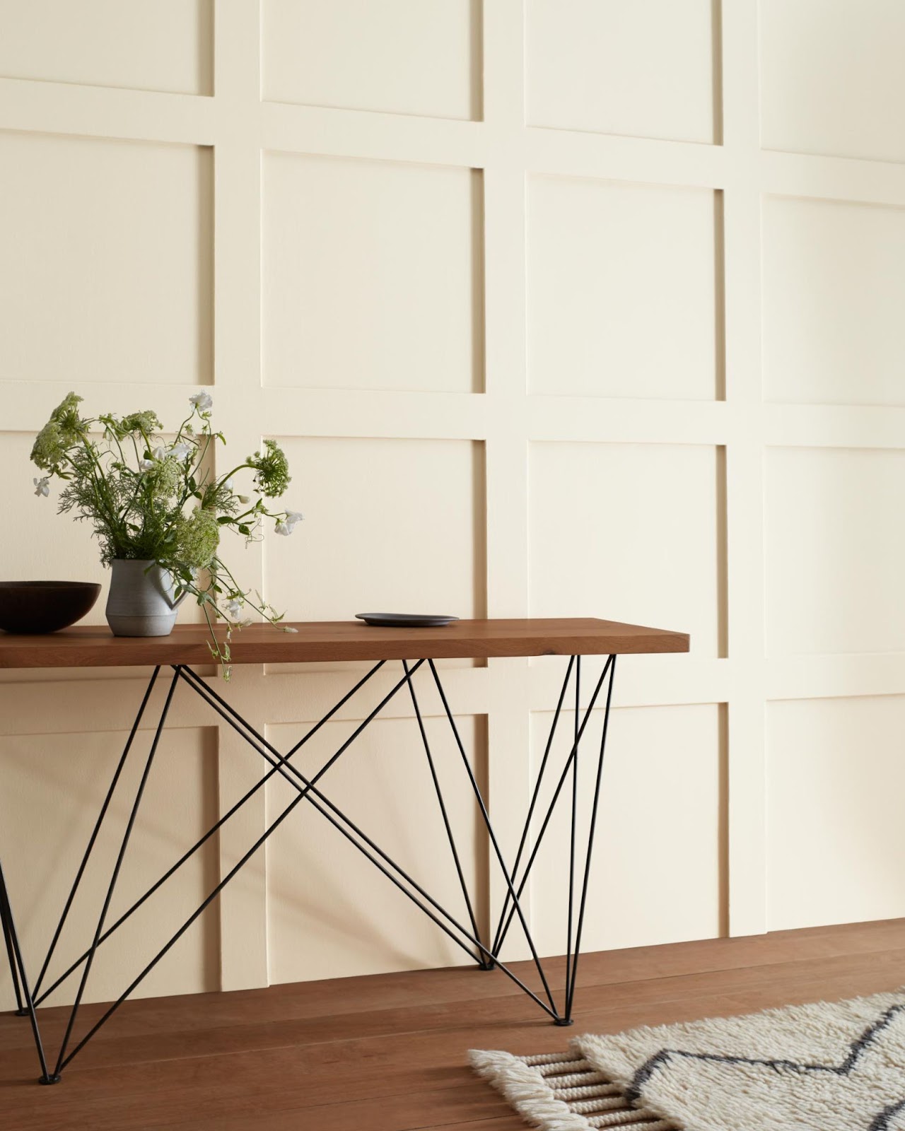
Benjamin Moore's Swiss Coffee is an off-white paint color that is known for its warm undertones of yellow and beige. Under certain lighting conditions, Swiss Coffee might have a slightly greenish hue. Because of its versatility and ability to complement different design styles, Swiss Coffee is a favored option among homeowners and designers. It is often applied to walls, trimmings, and other architectural features and can be matched with various colors and finishes.
Best uses for Swiss Coffee in interior design
- Living rooms: Swiss Coffee creates a warm and inviting atmosphere, making it perfect for spaces where people gather and socialize.
- Bedrooms: The subtle warmth of Swiss Coffee creates a soothing ambiance, ideal for promoting relaxation and restful sleep.
- Kitchens: When paired with white or light-colored cabinetry, Swiss Coffee can help create a bright and airy space that feels both modern and timeless.
Pros of choosing Swiss Coffee
- Versatility: Swiss Coffee's warm undertone allows it to work well with a variety of color schemes and design styles.
- Timelessness: As a neutral color, Swiss Coffee remains a popular choice for years to come, ensuring that your space will not look dated.
Cons of choosing Swiss Coffee
May appear too warm in some lighting conditions: In spaces with a lot of natural light, Swiss Coffee might look warmer than intended.
Sherwin-Williams Alabaster
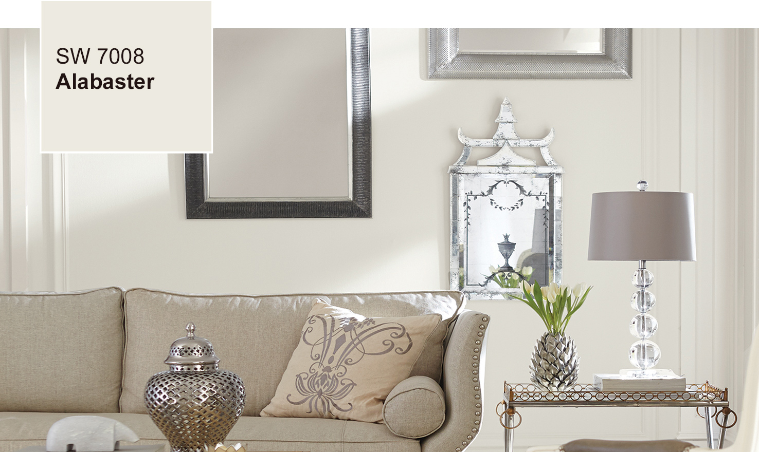
Sherwin-Williams Alabaster is a popular white paint color that is versatile and can work well with various design styles.Alabaster is a white paint color with a neutral undertone. This gives it a clean and modern look, which is why homeowners and designers often choose it. Sherwin-Williams offers a collection of white paint colors that includes Alabaster as well as other shades like Snowbound and Pure White.
Best uses for Alabaster in interior design
- Bathrooms: Alabaster's clean and crisp appearance makes it a great choice for creating a serene and spa-like atmosphere in bathrooms.
- Home offices: The neutral undertone of Alabaster can help create a focused and productive workspace.
- Open-concept spaces: Alabaster can provide a seamless transition between different areas of an open-concept home, helping to create a cohesive and harmonious design.
Pros of choosing Alabaster
- Clean and crisp appearance: Alabaster's neutral undertone gives it a clean and modern look that works well in various design styles.
- Easy to pair with other colors: The neutral nature of Alabaster allows it to work well with a wide range of accent colors, making it easy to incorporate into your existing design.
Cons of choosing Alabaster
May appear stark in some lighting conditions: In spaces with limited natural light, Alabaster might look too crisp or stark.
Comparison: Swiss Coffee vs. Alabaster
Swiss Coffee and Alabaster are both popular off-white paint colors that have some key differences to consider when making design choices. Although both colors are versatile and work well with various design styles, they differ in their undertones. Swiss Coffee has a warmer undertone, making it an ideal choice for creating cozy and inviting spaces.
In contrast, Alabaster has a neutral undertone, giving it a cleaner and more modern appearance. Despite these differences, both Swiss Coffee and Alabaster are timeless colors that can ensure a space will not look dated. When deciding between the two, it is important to consider the overall design style and atmosphere that you wish to create.
Tips for Selecting the Right Color for Your Space
- Consider the lighting in your space: The appearance of paint colors can change depending on the lighting conditions. Be sure to test the colors in your space before making a decision.
- What is the purpose of the room: Swiss Coffee's warmth may be better suited for social or relaxing spaces, while Alabaster's crispness may work better in areas where productivity and focus are desired.
- Assess the existing color scheme: Think about the colors of your furniture, textiles, and other design elements in the room when choosing between Swiss Coffee and Alabaster. Both colors are versatile, but one may work better with your existing color scheme than the other.
Possible Design Examples Using Alabaster and Swiss Coffee Paint
Swiss Coffee
Cozy living room - A family living room featuring Swiss Coffee walls, accented with warm wood tones and a mix of patterned textiles, creates a welcoming and comfortable space for gatherings and relaxation.
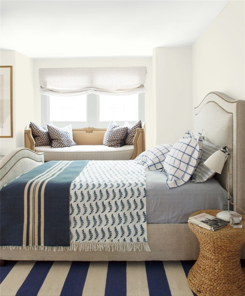
Tranquil bedroom retreat - A master bedroom painted in Swiss Coffee, paired with soft, neutral bedding and natural textures, promotes a calming atmosphere perfect for unwinding after a long day.
Alabaster
Bright and modern kitchen - A kitchen with Alabaster walls and cabinetry, complemented by stainless steel appliances and sleek countertops, creates a clean and contemporary space ideal for cooking and entertaining.

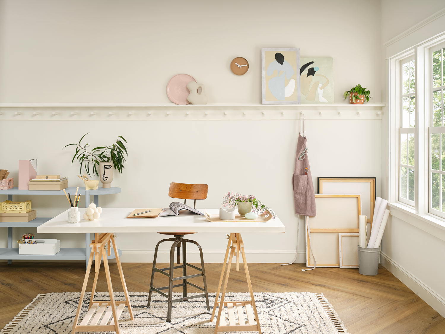
Serene home office - An Alabaster-painted home office, paired with light wood furniture and green plants, provides a focused and productive workspace with a touch of natural beauty.
Bring Life to Any Space with Swiss Coffee or Alabaster Paint
Both Benjamin Moore's Swiss Coffee and Sherwin-Williams' Alabaster are popular and versatile neutral paint colors, each with its own unique characteristics. Benjamin Moore and Sherwin-Williams are well-known and reputable paint brands that produce high-quality paints. The popularity and widespread use of these specific paint colors, Swiss Coffee and Alabaster, confirm their high quality as well.
No matter which color you ultimately select, your home will benefit from the timeless appeal and versatility of these popular neutral paint colors.
Get Smarter About Building Products
Join 50,000+ subscribers and get our 3 min daily newsletter on what matters in the building materials industry.
You might like this

Edgecomb Gray vs Revere Pewter: Greige Color Showdown
When it comes to the battle of Edgecomb Gray vs Revere Pewter, these two popular paint colors from Benjamin Moore offer unique characteristics that make them both highly sought-after choices for interior and exterior applications. In this in-depth analysis, we will explore the subtle differences between Edgecomb Gray and Revere Pewter, as well as their […]

Lifetime Steel Post vs PostMaster Fencing: In-Depth Guide
When it comes to fencing, the choice between Lifetime Steel Post and PostMaster Fencing can be a challenging decision for both DIYers and professional builders. In this blog post, we will dive deep into the features and styles of these two popular fence posts options. Lifetime Steel Post Features and Styles The Lifetime Steel Posts […]

Sunrise Windows vs Andersen: Comparing Quality & Efficiency
When it comes to choosing the right replacement windows for your home or construction project, Sunrise Windows and Andersen are two leading contenders in the market. Both companies offer a variety of window options with distinct features and benefits that cater to different needs and preferences. In this comprehensive comparison between Sunrise Windows vs Andersen, […]